Himeya
Client: Himatsingka Seide Ltd
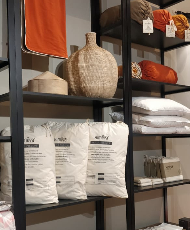
Identity and packaging design for Himêya, a home linen brand.
Identity & Packaging
The identity and packaging was developed with the above ethos in mind. The Himêya logotype is simple, minimal & modern with a neutral palette. The packaging has a simplified foil-stamped line drawing of a cotton flower set against recycled paper. The idea was to focus on the product–the finest bed linen and towels that are made from ethically sourced cotton & consciously crafted.
Website
The Himêya website was designed to be more than just an online shopping site–since Himeya is about mindsets, and not just products. Today’s consumers are well-informed, discerning and want to know how their products are made, where they come from, and what they stand for. These are addressed in the website by taking the customer through Himeya’s provenance, its ethical sourcing of cotton and conscious manufacturing processes. The Himeya Journal (blog) is a space that focuses on the brands philosophy of self-care, restorative experiences and helps debunking myths like the thread count debate among others.