Happy Healthy Me
Client: Happy Healthy Me
Packaging system design and illustrations for a stand-alone organic food brand and grocery store in Bangalore.
Packaging System
Incorporating all structural and system constraints, we worked on designing a label system and visual direction that used typography as the primary method of conveying the different levels of information each pack required.
The label information system also needed to function regardless of size, material, type of pack (glass bottles, paper pouches, plastic bags etc.), amount of content while also being future-proof for the brand. This was a task which also involved several rounds of testing and tweaking with the founders to arrive at the final direction.
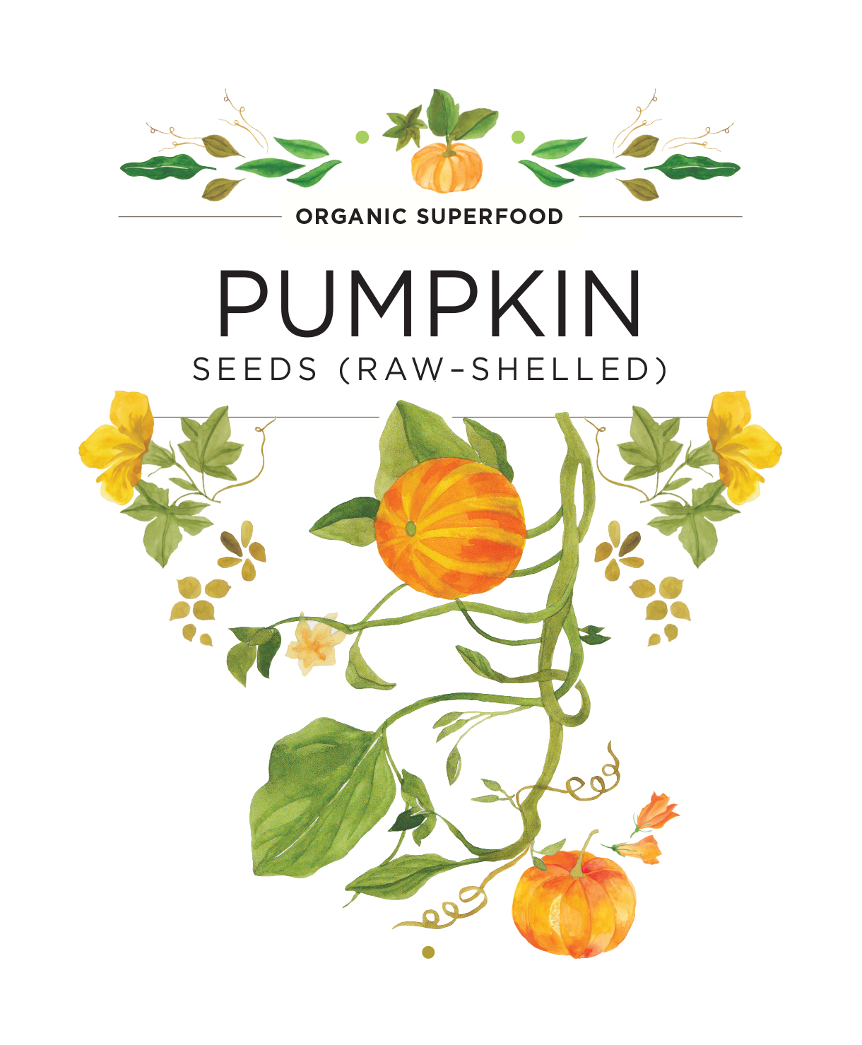
Illustration Style
We also created a visual catalogue so each individual HHM pack could feature a unique hand-painted (by Tonic) watercolour illustration. These varied from representing the product in its natural form or a more abstract representation of it. This combination of watercolour paintings with clean typography and neutral backgrounds, created a brand visual language that was elegant, fresh and light.